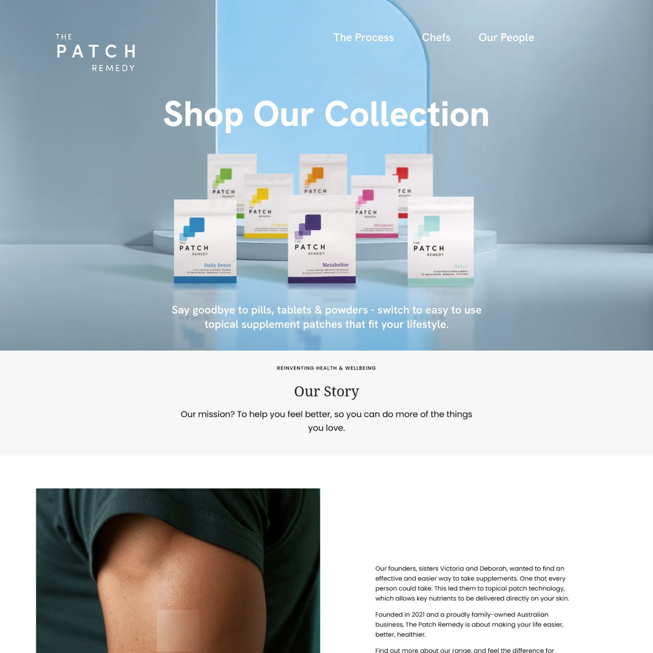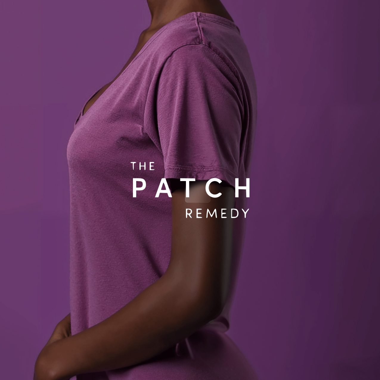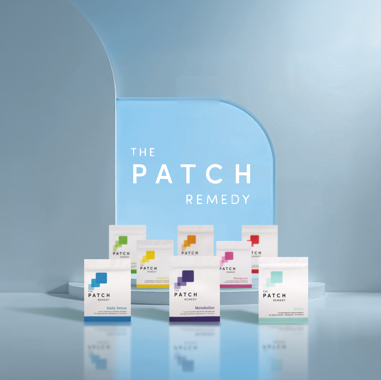
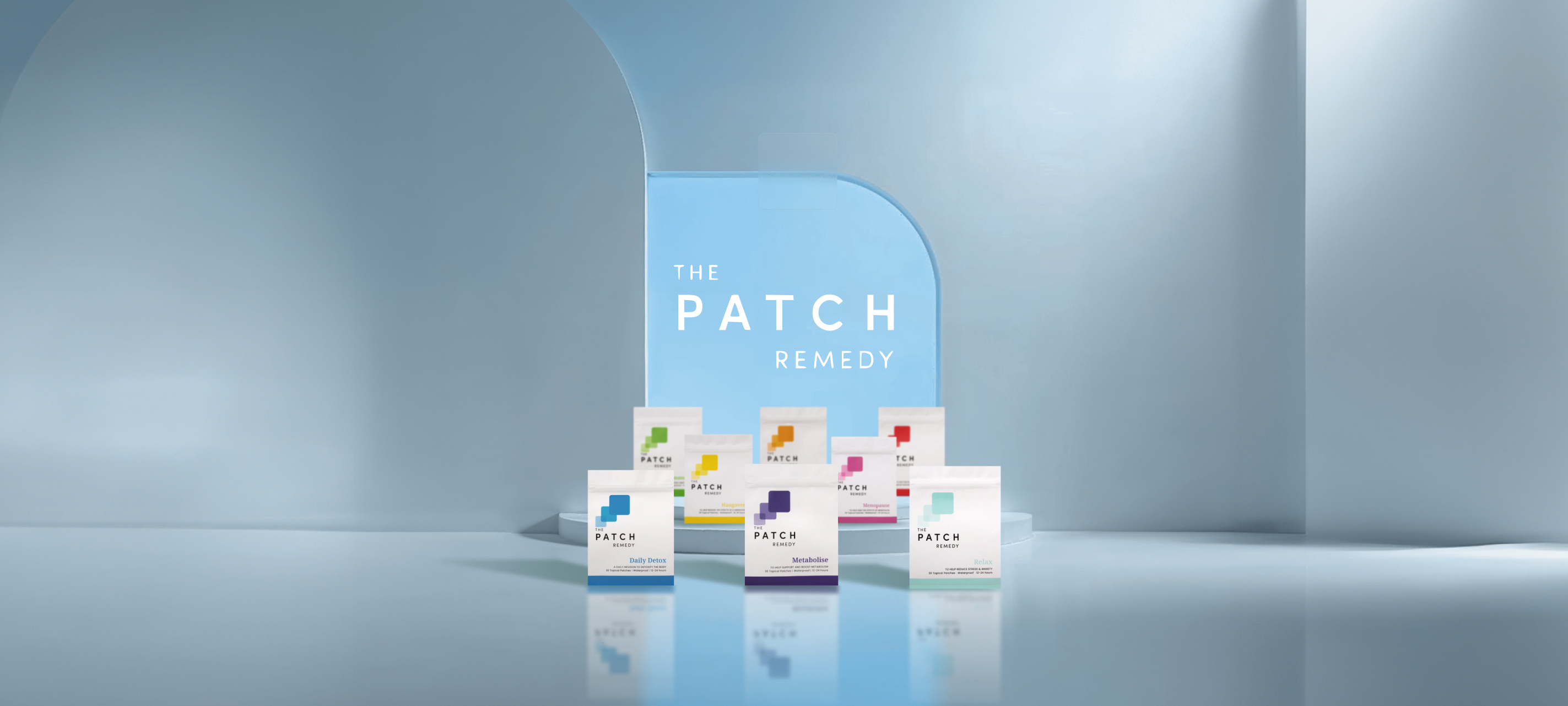
The patch remedy
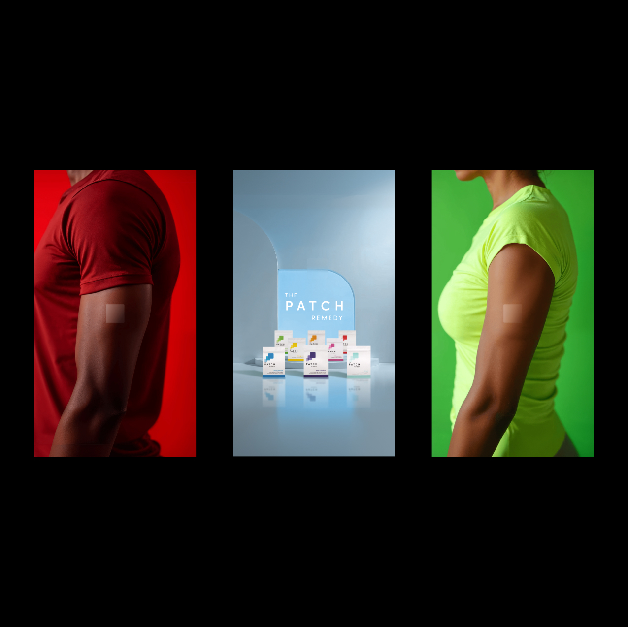
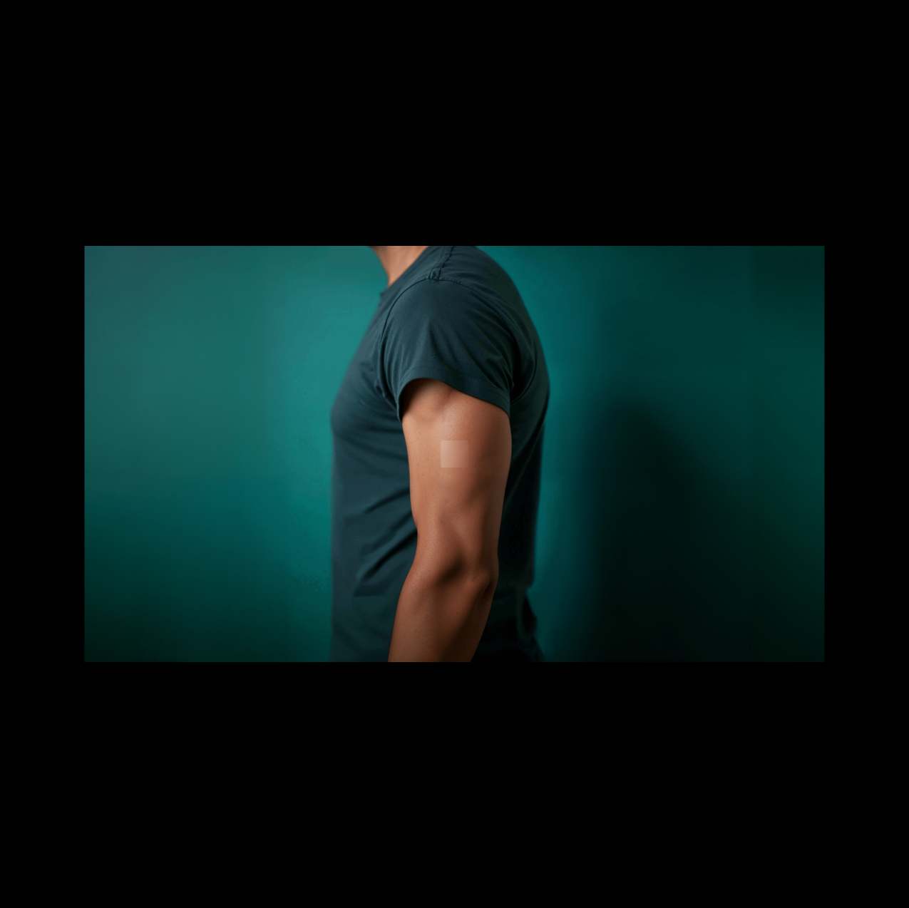
Created for The Patch Remedy, this project embraces a high-saturation, high-energy visual language designed for web and campaign environments, where attention is captured instantly and held through intensity.
From Passive to Electric:
Wellness brands often default to soft, muted palettes, creating a sense of calm but losing visibility in crowded digital spaces
A. Challenge
Low contrast and safe aesthetics fail to compete in fast-scrolling environments, reducing engagement and memorability.
B. Insight
Attention is driven by disruption. Saturation, contrast, and bold color relationships create immediate visual hooks.
C. Concept
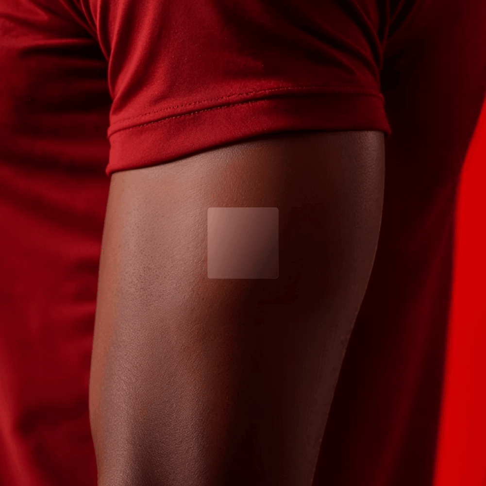
A hyper-saturated system of vibrant gradients, sharp lighting, and amplified tones, where the product becomes a visual trigger, optimized for scroll-stopping impact across digital campaigns.